Pepper Design Blog
A Little of This & That... Renovating, Decorating, DIY Projects & Family
Affiliates
pepperdesignblog's ideabooks
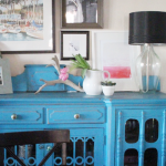
Dining Room Addition: A New Watercolor for the Buffet
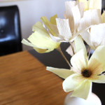
Deal to Share: Crepe Paper Flowers
Dining Room Update: Giant {Pink!} Art for Spring
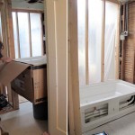
A Year in Review! Our 2012 Home Progress
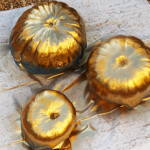
Gold ‘Dipped’ Pumpkins & Our Trip to the Pumpkin Patch
Dining Room Update: The Tale of a Tree
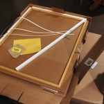
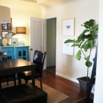
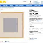
Dining Room Update: New Ikea Art Illustrations
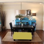
Dining Room Dilemma: A Colorful Bench
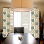
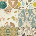
Dining Room Update: Curtain Call Part 3
Dining Room Update: Rug Tour
Dining Room Update: Curtain Call Part 2
Dining Room Update: Curtain Call
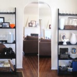
Dining Room Update: New Finds for the Bookshelves
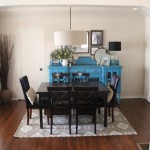
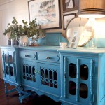
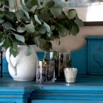
Dining Room Update: Time for a Buffet-Over
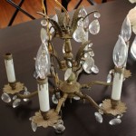
Dining Room Update: The Lighting Upgrade
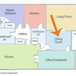
The Dining Room: Then, Now & On Its Way!
Easy Vase Terrariums
DIY Chevron Painter’s Tape Cloth Napkins
Office Makeover: Chocolate Brown Walls?
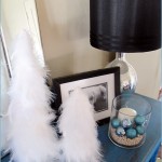
Feathering the Nest for Christmas
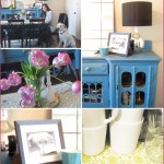
Before & After: Antique Sideboards
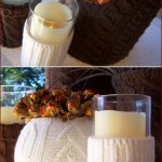
Just in Time for Fall: Recycled Sweater Vases
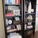
Bookshelf Styling: Ten Quick Tips
DIY: Teacup Candlesticks
Rooms Inspired by the Month of April
Guest Blogging… Over at 6th Street Design School!
Favorite Trend: Imperial Trellis Pattern
{Vintage Nesting} DIY Linens & Book Art
1
2
Next Page »