The curtains are up!
– UPDATE – (Thanks to all of your lovely responses about how low the curtain rods in the images from earlier today were hung – I absolutely agree, how did I miss that? and prefer rods hanging higher as in this bedroom makeover – and have moved the rods several inches north! If you’re reading this post for the first time you don’t have to see the low hanging curtain version ;) )
There’s just one final step in finishing my mammoth-of-a-project lined drapes, and that’s hemming these babies (here’s links to Part 1 and Part 2). To get a more accurate read on where these drapes hit the ground (so I can hem just above that mark) I’ve added the curtain rings ($4.99 a set at Target) to the tops of the panels and am letting them sit in this position over the weekend to let the heaviness of the fabric stretch out.
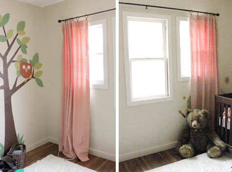
After that they’ll get another set of pressing (don’t worry, those wrinkles will go away and the folds will be a bit more defined) and a final trip to the sewing machine. Woohoo!
Go ahead and ignore that broken light sconce hanging out of the wall below. That’s a few items down on the list!
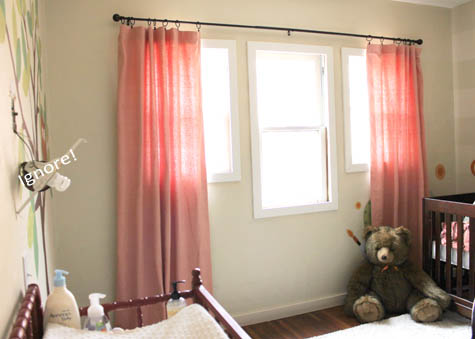
Just in case the curtains are showing up a bit orange on your screen, here’s how they’ll look when matched with the crib bedding that’s in the works.

The actual color of the curtains is above on the right, the new bumpers will be the stripes in the middle, and the skirt will be out of the fabric on the left. All found here at Thibaut!
Now one more question – to valence or not to valence?
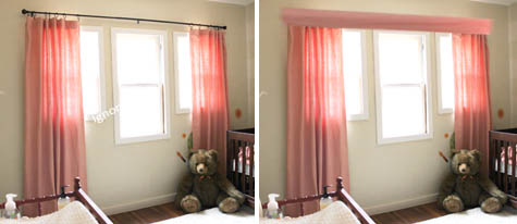
Does it add a little something special? Or too much? My photoshop version isn’t great, but it’s a rough idea of what it might look like to include a valence. The jury is still out on this one.
Almost there. Hopefully the awkward lighting in this post will make the big reveal later that much sweeter. Fingers crossed.
If you’re catching up on Project Nursery, here’s a link to the sewing the curtains part 1, part 2, nursery fabric board, curtain fabric selection, rocking horse find, new pendant light, vintage wall art addition, changing table makeover, nursery wall striping tutorial, painted animal project, the initial inspiration board and the before picture posts.




I love the curtains! That was my favorite fabric to begin with – it’s so soft and feminine, but has that great modern pattern.
As far as the valance goes, I’m torn. I’m not much of a valance person, and I’m not sure I’d be up for it in a matching shade. That said, I’ve seen some adorable modern wooden valances. I think a valance would also help tie together all three windows. The middle window looks kind of naked without it. I’d vote modern, dark wood, clean lined valance.
On a side note, I’m noticing how much light is coming through the windows. Make sure you take care of that. If Olivia is anything like T; that much light (even if soft) will ruin naptime when she gets a little bit older!
Hi Party Mom,
Excellent point on the light! The goal of the ‘lined’ curtains was to blog out all of that light but I’ve found that it’s bright enough to sneak through! SO much for that theory ;), I suppose I should have considered blackout panels.
I love the idea of a wooden valence – will definitely have to look into it!
Thanks for your thoughts!
~Morgan
I vote with the valance (and yes, I agree the curtain rod should be raised) it gives it a “pulled together look”!
By the way, I’m your #1 Egyptian fan. I stumbled on to your blog a few months ago while looking for ideas for my daughter’s birthday. I’ve been hooked since, and been following the new addition to your family. As we say in Arabic, “Alf mabrouk!”
Aida,
I’m so thrilled to hear this! Thank you for your comment and hope to see you around here!
~Morgan
I’m really torn… Without the valance, it really does tie in the wood furniture (my initial reaction), but a valance would be so pretty and feminine (and I’d love the tutorial as well)!!!
This room is coming along beautifully… Will give me great ideas one day:)
At this height, no valance. If you move them up towards the ceiling a larger valance would work.
Ignore the light sconce? That was the best part! Ok. Just giving you a hard time.
I vote NO on the valance. The rod and rings provide a nice bit of rhythm and contrast and help spread a bit of the dark brown from the tree and the bear toy up around the room.
Hi!
I vote no valance! It’s a difference in lighting, you’ll have a bit less light than without, as light will enter the room and won’t be able to bounce directly on the ceiling and then spread all through the room, it’s like a small obstacle. Besides, the tube looks nice.
hugs!
I would vote no valance, but I think you should try mounting the curtains higher. It will make the walls & windows look taller. Right now they look kind of stunted. Love the curtains though, they are such a gorgeous color!
You guys are great! Curtain rods are mounted 5″ higher and look MUCH better. I’m embarrassed I missed this detail that makes a huge difference :).
~Morgan
I completely agree with Jessica. I was taught in school that as a general rule the installation should be halfway between the ceiling and the window frame. I like the “without” look. What a beautiful nursery you have created!!
My advice would be no valence and don’t hem them. Instead mount the rod higher, closer to ceiling. It will make the ceiling feel taller and you really do need to mount them at least 6″ above the window frame so that your curtain covers the entire window and you don’t get that strip of light peeking out.
I vote for raising your curtain rod above the windows. Yes, I watch HGTV too often, but I think this should do it and not be “too much!” :)
Nice job. I like the way the curtain rod ties in with the wood crib so I would say no valance. Maybe add a large colorful tassel/tieback to the ends of the rods for interest (keep them high enough so toddler ( afew months from now) cant pullthem) Have a great weekend in snowy san diego!
I vote no valance! The room is supper cute love the colors- glad to see something different than the typical blue or pink- Thank you!
The curtains are looking so great! I vote valance, just because it gives a cleaner look to the area at the top of the windows (and because we’d all love a tutorial!) :)
I vote no valance! They are so formal to me… even though I like how it finishes the look a bit, I love the whimsical, charming aspect of your room. Beautiful!